The First Year: Beecher’s
A Graceful Design
From our first meeting, a goal of the editors and staff of Beecher’s was to create not only a new literary journal run by students, and filled with challenging, inventive content, but also to create a beautiful object. Beecher’s One was going to be an artifact to hold and love, something that would leave an imprint on every fingertip that flipped its pages, something that stood out on a bookshelf. Something that kicked Kindle’s ass.
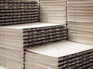
One of the first ways we tried to accomplish this was by creating Beecher’s Zero. Robert J. Baumann, our first poetry editor, created a handmade chapbook filled with short entries from the editors about aesthetics. This would be the reader’s first introduction to who we are, and what’s important to us. The craftsmanship that went into these led to the appearance of our first full issue. No matter how much turmoil went into creating the pages, when taking in the clean black and white book you feel the impact of the design.
We were lucky from the start, because we had a talented and experienced designer. Dan Rolf, our design editor, had a vision that fell onto, and in between, each page of Beecher’s One. When you discover you’re hungry after not realizing it, and then eat a really good meal—that’s how Rolf’s design makes you feel. Comfortably full, wanting to experience it again, and at the same time, not quite knowing all of the ingredients that made up the recipe.
Although I knew that we all wanted Beecher’s to be a beautiful object, I didn’t know how Rolf was going to go about accomplishing this. His answer reminded me that yes the design was important, but that it has to start with the writing.
_____
Dan Rolf, Beecher’s Design Editor, on creating the first issue:
“The first and most important aspect was to simply showcase the writing. Beecher’s is a literary magazine first and foremost, and we wanted the physical object to be a straightforward medium in which to experience the textual content.”
“But we also wanted the physical object to display a reverence for the interaction between a text and the reader. Because the act of reading from a physical book is also a tactile one, we wanted Beecher’s One to engage this fact. So, the second aspect was to make the physical object record this interaction.”
“The book has a naked spine and rigid, toothy, absorbent white paper that is meant to show evidence of the reader by literally absorbing and recording the reading experience: the hands holding the book, the fingers on the page, the bending of turned pages, the weakening of the unprotected spine. This recording of a reader’s interaction happens with every well-used book, but with Beecher’s One we wanted to lay bare this interaction, allow the recording of the interaction to become the adornment.”
_____
We hope that to know Beecher’s One is to hold it in your hands, run a fingerprint down the thread in the spine, see the black typeface imprinted into the white sheets, leave a fingerprint on the pages. We hope that our greatest triumph was to create an intimate, unique experience through the combination of writing and design.
Caitlin Frances Thornbrugh was born and raised in Kansas City. She studied Creative Writing and Women, Gender, and Sexuality Studies at the University of Kansas. She decided to stay in Lawrence to pursue her MFA in Creative Writing, where she is now working as the Managing Editor for Beecher’s.

